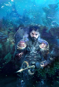
The evolution of a cover
After the last post, Alan Brooks has pointed me at some of the stages and deviations the Sea Watch cover went through. I'm hoping Alan will perhaps do a guest post on the various stages of the business, as there's a lot I never really guessed at — as a reader you just see the final cover without any idea of the sheer number of possibilities that get tried out and discarded. For example
 This is a version of the actual cover where the focus is pulled considerably further out, showing the city of Hermatyre very nicely in the background.
And here, in serious contrast, is what might have been had another idea for the cover figure been taken forwards — meet the Echinoi:
I would encourage you to check out some further iterations on Alan's site, for example, an even freakier Echinoi sketch, a first look at Rosander, and then a another Rosander shot that has a very SF feel to it. As you can see, they make the artist work for his money, and what actually hits the shelves is the tip of the proverbial iceberg.

 © 2008-2025 Pan Macmillan
This Echinoi is menacing enough — I wish I had a poster like this! Any other spieces in this style? Maybe it is worth to collect them all and make an album at the end of whole cycle? I wonder.
J.